 Josh Dick
An Event Apart Boston 2012
My notes from An Event Apart, "the design conference for people who make websites".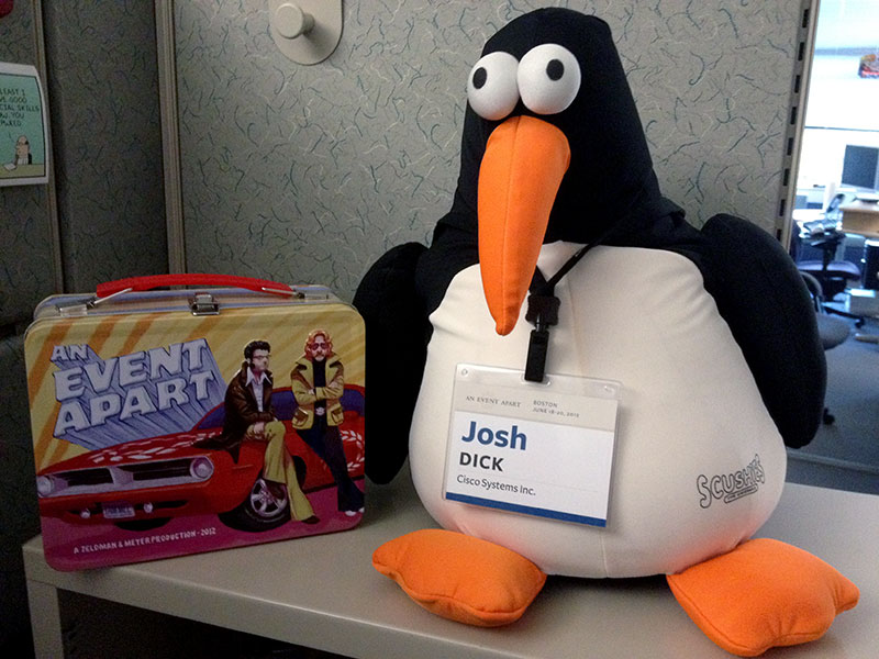
Fasten Your Seatbelts…
I was very fortunate to have the opportunity to attend An Event Apart Boston 2012 and hear talks from some of the biggest names in web design.
The conference happened during June 18th and 19th, which was before I started this blog. It is now exactly two months later, and I figured my notes from the conference would make for a long and scatterbrained but otherwise great blog post. Better late than never, right? Rather than just pare down or summarize my notes, I’ve decided to clean them up and post them here in their entirey. I didn’t want to omit any details!
My notes are organized by talk in the order that they happened at the conference. Attendees were live-tweeting each talk, and the conference organizers provided a Twitter aggregator called A Feed Apart. In each talk title below, I’ve linked to the appropriate A Feed Apart page, as well as each speaker’s web site and Twitter page.
Tweets from conference speakers and attendees are scattered throughout my notes, and for each tweet I’ve linked to the original source on Twitter in the leading @userame. The tweets I’ve included are either direct quotes from the speakers, or are memorable, interesting or humorous reactions from attendees that I think helped convey the overall mood at the conference.
Day 1: 6/18/12
Jeffrey Zeldman - Content First (zeldman.com • @zeldman)
- Content is a design problem - not a development problem.
- Designs are often hostile to content.
- Orbital content - users are coming to see your content regardless of how it’s presented. (Think Instapaper/Readability!)
- Designers may no longer control the visual experience (and maybe we never did); accessibility/large type/colorblind settings will override control.
- Bypassing your design is no longer a minority activity.
- Driven by users’ need for content.
- A designer’s job is to serve the customer; to connect the right user with the right content at the right time.
- “We have been trained over the years to know that anything in big letters at the top of the page is an ad…we haven’t figured out how to make content pay, so we trick people into clicking ads.” Design that does not serve people does not serve business. Don’t trick people into clicking ads.
- Content precedes design. Design in the absence of content is not design, it’s decoration.
- On Blogger templates: “people didn’t want their web site to have more character than their writing.” (Think of the popularity of the minimal Kubrick Theme for Wordpress).
- We work in sand. We are Ozymandias. Everything we do is impermanent. Web design is like “building sand castles in hurricane season.”
- Small screen means content first.
- If I see only the content on mobile, do I need to see lots of crap on the desktop version? I’ll just go to Instapaper/Readability for my content.
- “What’s good for mobile may be good for all.” Give the user what they want.
- “If we don’t design with content first, our users will do it for us.”
Whitney Hess - What’s Your Problem? Putting Purpose Back into Your Projects (whitneyhess.com • @whitneyhess)
- “Design is problem solving”.
- Define the problem before trying to solve it
- Ask questions to root out the truth
- Be obsessed with the problem, not the solution.
- Define the problem before trying to solve it
- Problem setting > problem solving
- Not everything we see as a problem is actually a problem; it’s a gap between current and desired state, and that the problem owner wants to do something about it.
- Designers don’t get to decide what the problem is.
- Who is your target audience?
- Ask questions to root out the truth
- The problem is out there, not at your desk.
- You need to get out into the world your users live in, in order to really understand them.
- Designers are anthropologists.
- Market research: what people like. User research: what people do (getting to their individual frustrations).
- Great design affects the way people do things, so knowing what they do beforehand is critical to figuring out what you want to create.
- “5 whys”: To get to the root of a problem, just keep asking “why?” Can map 5 whys to a “fishbone diagram” tree structure to show cause and effect.
- When you communicate the problem clearly and emphatically, you get believers.
- “How can I help you be more successful?” Ask stakeholders and users.
- Life is too short to waste it solving the wrong problems - make stuff that matters to your users, your organization, and to you.
- Interview people until you stop hearing new things.
Jason Santa Maria - On Web Typography (jasonsantamaria.com • @jasonsantamaria)
- “This is what typography does. It makes you say mean things to your family and former friends.”
- “If you’re not a font geek or don’t want to be a font geek, you certainly hate happiness.”
- Type is important because it unifies visual language and builds equity in that identity. People recognize the New Yorker’s typeface.
- “If your type is bad, the design fails.”
- “The term readability doesn’t ask simply ‘can you read it?’ It asks, ‘do you want to read it?’”
- There is a difference between legibility and readability. Just because you can read it doesn’t mean you want to.
- What makes a typeface good or bad?
- “I…I hate Papyrus.”
- “No typeface is born evil, it’s the context that matters.”
- Typography can change/phrase the conversation.
- “Type is a beautiful group of letters, not a group of beautiful letters.” –Matthew Carter
- Display faces (meant to be used large) vs. text faces.
- Workhorse typeface: all the details that make it good at display size also make it good at text sizes. (Bodoni vs Meta)
- What we actually see when we look at type is just texture, not what we think we see.
- Saccade: The concept that eye position jumps during reading.
- Stopping at a jump is called a fixation.
- “I am a scientist reading science stuff, with big, sciencey words.”
- Most information about what makes a letter a letter is in the top half of that letter. You can still read it if bottom is cut off, but it’s much harder to read when top is cut off.
- Good typography is invisible, in the sense that it shouldn’t make the reader think.
- There are no rules in typography, only principles/guidelines/best practices, because nothing works all the time.
- “If anyone’s told you there are rules to typography, they’re wrong. Dead wrong.”
- Guidelines ahoy!
- Bigger is better; always err on the side of making things too big rather than too small.
- Contrast is the most important tenet of graphic design. It gives people a map to traverse our content. Everything is defined by its opposite.
- Line length and line spacing: Need space between lines so eyes can find their way back. Lines that are shorter can be packed together more tightly.
- On selecting a typeface:
- “Can you recommend a good font?” is a horrible question because it lacks context. It’s like asking “I’m going to paint a painting…what color should I use?”
- Dimensions, special features, prolonged reading, internationalization
- Avoid readymades where the design is baked in. They’re the “microwave burrito of typography.”
- “Of course this font is called Playground. What the hell else could it be?”
- Think about what you’re trying to say with your typefaces.
- Look for typefaces that were designed together as families.
- “If you’re sick to death of Helvetica (and why wouldn’t you be), look for alternate typefaces that have the same feel. What makes Helvetica, Helvetica?”
- Try it out! Because it depends so much on context, you have to see how it feels where it is when you use it!
Scott Berkun - The Five Most Dangerous Ideas (scottberkun.com • @berkun)
- Everyone is a designer.
- @evanwarner: .@berkun added photos to his presentation from the floor of #aea. Great tactic that makes the talk personal to the audience.
- Fixing design problems in daily life.
- Rats. My client thinks he is a designer. “I want something that has more sizzle.” “Can you make it ‘pop’?”
- He is a designer, just an extremely bad one.
- Designers are ambassadors for good ideas.
- Your job as a creator is to help other people get working with good ideas.
- Good designers are the only mentors for bad designers.
- You have no power.
- What decisions are completely yours?
- People with complete creative control are artists.
- In the middle is designer/engineer.
- If you hunker down with ideas philosophically, you’ll never allow yourself to ask questions you should be asking.
- If you have little territory, fortifying it buys you nothing.
- Whoever uses the most jargon has the least confidence in their ideas. If you really believe in your ideas, you wouldn’t need any jargon.
- Power can be granted (most common), earned, or claimed.
- In good organizations, the people who were granted power have also earned that power.
- Who will go to the whiteboard first? If you go to the whiteboard first, you instantly gain power.
- You don’t have to be a certain rank to go to the whiteboard first!
- If there are more than 5 people in the room, you have less power than you think.
- Meetings are a powerful misrepresentation of how decisions are made.
- In-room power vs. out-of-room power:
- In-room - debates/talking in person.
- Out-of-room - can be the most important power to have. Catch the person after the meeting and you can change their mind!
- Generalists are in charge.
- Ownership/Accountability/Involvement
- How much of yourself will you put behind your own ideas?
- We work in sales (regardless of your job title.)
- Even if your ideas are good, you’re going to spend a lot of time pitching them to people and getting rejected.
- Everyone has to pitch ideas.
- “I’m giving a pitch about pitching within a pitch.”
- “Talk to people you don’t like.” -Samantha Starmer, REI
- We got into tech so we can work with software, instead of all the people we don’t like.
- If people think you are smart and useful, your job title is irrelevant. Same as if they think you’re dumb and useless.
- Creativity is risk.
- Have the confidence to put your ideas out there.
- It’s one thing to get your pitch turned down, but who can you blame if you don’t give one?
- Who will:
- Ask the tough question?
- Do the extra work?
- Be willing to fail, and learn?
- Put their reputation on the line?
- Commit to a big, crazy idea?
Karen McGrane - Adapting Ourselves to Adaptive Content (karenmcgrane.com • @karenmcgrane)
- “We’re about to usher in a golden age of PDFs on the iPad.” –Paul Ford, @ftrain
- COPE: Create once, publish everywhere - NPR
- Liberated NPR from being dependent on custom development to get at content.
- Adaptive content
- Starts with well-structured content designed up front to live in a variety of different places.
- TV Guide wasn’t in the magazine-publishing business, they were in the content-publishing business.
- Evolved to guide content on today’s cable boxes and DVRs.
- Multiple sizes / meaningful metadata / written for re-use.
- All display issues should be addressed by delivery applications, rather than by a content management system earlier in the process.
- The primary platform? All other platforms aren’t the “real” platform.
- Some publishers still believe the “primary platform” is still print.
- Existing workflows/styling/design can’t be repurposed for other platforms.
- Write for the chunk (content package), not the “page”.
- Demystify metadata.
- “Truncation is not a content strate…”
- A CMS should be managing the content chunks/metadata rather than the visual presentation.
- Today’s CMSes don’t allow for describing how content is structured.
- We need better CMS workflows.
- Metadata:
- Programmatically builds pages.
- Helps prioritize content.
- Supports designing for content.
- “Metadata is the new art direction. –Ethan Resnick, @studio101
- Content creators hate CMS fields because the workflow is terrible and not designed to meet their needs.
- Today’s CMSes are an interface to the data model rather than a task-oriented solution to help content creators do their jobs.
- “A lot of CMS systems look like a database got drunk and vomited fields all over the screen.”
- “CMS is the enterprise software that UX forgot.”
- Real usability is predicated on a workflow. Make the process for content creation as simple as possible for the user of the system.
- Use mobile as a wedge to drive a sea change for content management infrastructure.
- “The more structure you put into content the freer it will become.” -Rachel Lovinger, @rlovinger
- Separation of content and display – for real this time.
- @globalmoxie: At #aea, @karenmcgrane points out best content comes from tools that get out of your way. Echos @jasonsantamaria: best typography does same
- “I’ve never seen anyone regret having flexibility in how they deploy content.” -@eaton
Ethan Marcotte - Rolling Up Our Responsive Sleeves (ethanmarcotte.com • @beep)
- Where do I begin with responsive design?
- This is a talk about solving the parts.
- A matter of layout
- thegreatdiscontent.com
- Every responsive design is based on a flexible grid.
- Basic formula: target / context = result
- Key characteristic of a well-formed typographic grid is proportions rather than individual pixels.
- Responsive stylesheets used to default to widescreen layout and add media queries for mobile on top of it.
- This should be reversed…mobile first, then progressively enhance for full widescreen browsers via JS/media queries.
- The absence of support for media queries is in fact our first media query.
- Layout needs to be treated as an enhancement.
- Start small, with content chunks (reiterating Karen McGrane’s view on content!)
- Width, hierarchy, interaction, density
- Simplify before you suppress. Strip away unnecessary information and leave only what matters to your readers.
- Content before navigation.
- Design your source order and see how that informs the rest of your layout.
- Starbucks’ responsive site includes a style guide.
- We’ve been too focused on columns. Let’s refocus on content.
- Media queries - remove from breakpoints connected to known devices/resolutions.
- Instead, create breakpoints connected to your content (em-sizes).
- paulrobertfloyd.com
- Advertising
- “Let’s kill some dreams and talk about advertising.”
- Unfortunately ads on the web are fixed-width and designed for desktop.
- Smashing Magazine simply hides the ads on smaller screens.
- Boston Globe hides lower-priority ads as screen real estate shrinks.
- Media and images
- ediblevineyard.com
- Responsive videos: ratio-aware video content box using relative positioning and padding-top of percentage-based aspect ratio (16/9), with 100% max-width absolutely-positioned video inside it.
- @globalmoxie: This:
img, object, video { max-width: 100%; }#aea
- Establish smart defaults, but allow the reader to override them easily.
- For example, a responsive table could auto-hide columns but allow the user to toggle all columns at any time.
Day 2: 06/19/12
Eric Meyer - The Future of CSS (meyerweb.com • @meyerweb)
- Wrap
<label>tags around<input>tags rather than next to them. - @jessweiss: Users have the annoying habit of using the browser they like instead of the one on my machine. LOL! @meyerweb #aea
- “Form elements are the devil as far as styling goes.”
- The first shadow you list in a comma-separated list of shadows is ON TOP - it wins. (
text-shadowandbox-shadow)- Counterintuitive since it doesn’t follow the cascade.
- @AprilDiMArtino: “I apologize to those of you trying to sever your optic nerves.” @meyerweb at #aea while showing a simple example of text-shadow in CSS.
- @globalmoxie: “Let’s party like it’s 2000! … (Did I get that reference wrong?)"—@meyerweb #aea
- @beep: @aneventapart “You may never actually do this to your buttons.” #aea #innuendoorCSStip #whocansay
- 90-x to switch between math angles and compass angles (either direction.)
- Useful for vendor-prefixed and unprefixed versions of linear-gradient which use opposing coordinate systems.
- “transparent” - this keyword can be considered equivalent to fully transparent black. (RGBA 0,0,0,0)
- @BrightBold: “Gradients don’t have to be about making it look like the sun is setting behind your webpage.” - @meyerweb #aea
repeating-linear-gradientisn’t ready for prime time yet (too buggy and inconsistent across browsers). Stick with images instead.- @BrightBold: “When I was your age, all we had was two bits! And we were grateful!” - cranky old man @meyerweb #whoisyoungerthanme #aea
text-rendering: optimizeLegibility;- @stuntbox: I do believe @meyerweb just referred to type ligatures as “pair bonding”. #AEA
- @ThisIsDannyZ: Careful using optimizeLegibility. It will increase page load time. Use it only on H tags and quotes. #aea
Scott Jehl - Interacting Responsibly (And Responsively!) (scottjehl.com • @scottjehl)
- “Disgraceful degradation: a shockingly unacceptable user experience.”
- All of your users are “non-JS users” while the page is loading.
- Developer conveniences are killing performance.
- “Every HTTP request is a gamble.”
- “Am I thinking about my own clock, or the user’s?”
- 2 ways to slim a page down:
- Reduce features/remove content
- Prioritize the loading of essential content and defer the rest!
- ajaxInclude plugin replaces lightweight DOM with more detailed replacement via data-replace attribute.
- quickConcat dynamically converts many files into one file. Works for JS/HTML.
- Can use media queries to trigger ajaxInclude so devices only load the content they need.
- Pattern can be found on GitHub page.
- Brand new EnhanceJS, not the one from two years ago.
- @beep: @aneventapart: “Load only a tiny bit of JavaScript, which then lazily loads more JavaScript. And we all want more JavaScript, right?” #aea
- It’s time to start crafting JavaScript like we craft CSS.
- Minimal DOM framework - “Wrap” from Filament Group
- @beep: @aneventapart: Great point by @scottjehl: UA-based logic can’t anticipate later changes in the client. (Orientation/font-size changes, &c.)
- More information about the tools mentioned in this talk is available at GitHub.
Josh Clark - Buttons Are a Hack (globalmoxie.com • @globalmoxie)
- Touch will force fundamental changes in the way we think about interfaces.
- Traditional UI elements don’t work well with a touch interface, particularly as the interface gets larger.
- “I hate the iPad’s back button with the heat of a million suns.”
- “Fitt’s law is why Golf is such a miserable sport.”
- “Gestures are the keyboard shortcuts of touch.”
- Ability to swipe on the whole screen instead of picking at tiny buttons.
- @globalmoxie: Emerging pattern for pinch gesture: zoom in and out of hierarchy. E.g. pinch to close detail view, return to list. #aea
- @bellatrixr: @globalmoxie has scheduled his tweets of main points in sync with his live presentation. <keanu_whoa> #aea
- @brandon_merritt: What is this dark magic?! @globalmoxie is live tweeting his own talk! #aea
- Touch - “Big screens invite big gestures.” Don’t make the user hunt and peck for tiny controls.
- @seanmcg: “Big screens invite big gestures.” - @globalmoxie at #aea. Soon we’ll be body slamming our HDTVs.
- @uxcora: Imagine your data as physical then decide how you and then decide how they would be manipulated e.g. cards, pages @globalmoxie #aea
- @mbloomstein: “How do I imagine my data with physicality? If it were pieces of paper, how would I navigate?” @globalmoxie on gesture #aea
- @artlawry: Hoping @globalmoxie discusses how to teach users/how users discover touch events they may not be used to in the context of web #aea
- The Web (browser) is inside of every application instead of every application being inside the Web (browser). -LukeW
- Muscle memory is much faster than visual memory.
- We always start with hunt-and-peck.
- There are very few natural interfaces. We are born knowing how to pee, cry and eat. Everything else is learned.
- As designers, we want to solve the problem of people being faced with uncertainty.
- Visual cues for touch: Rather than explicit guides/buttons/cues, use the content as the label.
- How can I interact with content?
- The content is the interface.
- Up-front instructions are overwhelming. Would we need those for a paper magazine as opposed to a digital magazine?
- Nature doesn’t have instructions
- If it looks like a physical object, people are going to try to interact with it like one.
- iOS calendar/datebook app page-turning inconsistencies.
- “Follow the toddlers.” Toddlers are better at this than we are since their brains haven’t been poisoned by 30-year-old user interface conventions.
- Video game designers are fantastic at teaching interfaces, in the moment.
- Coaching, leveling up, and power-ups.
- Coaching
- Respectful, subtle, not Clippy. Good contextual help (coaching) means your first interaction with a feature is always a success.
- USA Today app swoops in its navigation to coach the user that they can swipe across it without using explicit instructions. Coaching stops when the user is actually using the functionality.
- Visual cues are how people find gestures, gotta have em. Gesture without visual aid is a suitcase without a handle, useless.
- Leveling up
- Infinity Blade tutorial
- OSX Lion “scroll up to hit continue” at end of installer
- Think about app as levels. Guide me from level 1, level 2, to master. Don’t overwhelm me with instructions all at once.
- Front-loaded instructions make apps feel HARDER to use.
- Share our own patterns with each other!
Luke Wroblewski - Mobile to the Future (lukew.com • @lukew)
- @globalmoxie: Of all mass-market tech (phone, electric, computer, radio, tv, internet), smartphone fastest yet to reach 40% penetration in US. @lukew #aea
- Mobile devices can do the same things that all previous forms of mass media could.
- TV isn’t radio, just like mobile isn’t desktop.
- Mobile login experience sucks. LinkedIn/Walmart, “forgot password” links
- “Show password” should be “hide password” - smart defaults stick. We need to see what we’re actually typing!
- Twitter and MobileMe use input masks to make entering “@” easier.
- Single-sign-on via OAuth.
- Except users might not know which social network they used to sign up.
- votizen.com - search-as-you-type on users, that shows the user’s stored login method. Can search by name or email.
- New ideas: Gesture-based login used in Windows 8
- iOS6/Android 3+: Can take pictures via
<input>tags - On entering iOS PIN after Android face recognition: “You don’t recognize me? You’re in my pocket all day! What am I to you?”
- Translating desktop to mobile: less focus on layout, REDUCE EFFORT. Things that aren’t required shouldn’t get in people’s way.
- Combining separate name fields/phone number (area code, ext, etc.) fields into one field
- Hide irrelevant controls!
<input type=tel>- Input masks, again
- @globalmoxie: Recurring theme at #aea: Tech changes like mobile/touch/multidevice create crisis, yes, but also opportunity to revisit & do stuff smarter.
- Stepper control instead of dropdown when there are few choices.
- Keep people on the keys.
- single-field credit card entry in Square app.
- Month entry:
<input type=month>. Fallback with input mask - Entire checkout form can be reduced to two or three fields total.
- @globalmoxie: Avoid “desktop experience put into small screen thinking.” Embrace mobile thinking instead. Small screen ≠ mobile. @lukew #aea
Dan Cederholm - Handcrafted Patterns (simplebits.com • @simplebits)
- Using patterns isn’t cheating. Everyone uses patterns.
- Learning something new: Imitation → Repetition → Innovation
- @aprildimartino: “Building websites is 99% convincing yourself that you are doing the right thing.” ~Dan Cederholm @simplebits #aea
- ARIA landmark roles can be used to distinguish importance of different
<header>s, etc for screen readers. - Don’t rely on advanced selectors for layout. (nth-child, etc.)
- “Slat” pattern - repeated lists of chunks using the same markup. Each tweet on Twitter is a slat.
- @globalmoxie: You know this? <h3><a>Headline</a></h3> Description Way more touch friendly (& valid html5): <a> <h3>Headline</h3> Description </a> #aea
- Every web site is a learning tool.
- Let content dictate flexible layout breakpoints.
- Adaptive layout
- Avoid
display: none; - CSS Generated Content that can be turned off in adaptive layouts (arrows between steps can be hidden, etc.)
- Avoid
- @globalmoxie: I like @stephenhay’s method for choosing breakpoints. “Start narrow, go wider wider wider. Oh wait, that looks like crap. Breakpoint!” #aea
Jared Spool - The Curious Properties of Intuitive Web Pages (http://www.uie.com/brainsparks • @jmspool)
- Intuitiveness keeps our focus in the right place.
- “It’s really hard to make a scrollbar. There are only about 6 people in the whole world who understand how they work.”
- Socially-transmitted functionality - someone showed you how to do it! Ex. pull-to-refresh
- TRAINING: Making current knowledge meet target knowledge
- SIMPLIFYING: Making target knowledge meet current knowledge
- INTUITIVENESS: What I know matches what I need to know.
- “Once you learn git, which can take a lifetime… often an entire weekend…”
- Large-scale redesigns are usually a disaster.
- Destroys the user’s current knowledge/introduces a knowledge gap.
- Better to update the design in pieces since you remove less current knowledge at once. Maybe you even reduce target knowledge.
- Look up the word clusterfuck in a dictionary and you’ll find MS Sharepoint.
- Don’t make me feel stupid.
- “I pay hundreds of dollars a year for my free internet access.”
- Security questions don’t work since they make people feel stupid, which detracts from intuitiveness.
- Hipmunk has swimlanes to show flight schedules and has “agony” as a sort criteria.
- “see price in cart” - Minimum Advertised Pricing, but this is unintuitive to users.
- Maximize goal time by reducing tool time.
- Look at your users’ entire journey.
Conclusion
An Event Apart was the first conference I’ve ever attended and I wasn’t quite sure what to expect, but it went above and beyond the expectations I did have. It was extremely well organized and gave me a full inspirational recharge. In fact, attending the conference was one of the things that motivated me to start this blog. (I was told by other attendees that An Event Apart in particular sets the bar very high as far as conferences go; I hope it’s not all downhill from here!)
I’ll let you draw your own conclusions from my notes, but I feel that these were the biggest recurring themes across all of the talks, at least in terms of the state of the art in web design:
- Content is king and should dictate the design, not the other way around.
- Design for mobile before designing for the desktop (“mobile first”).
- Designs should be implemented such that mobile is the canonical/primary platform, and the site should responsively adjust itself as necessary for other platforms (desktop). The days of designing and developing separate sites for separate platforms are over.
Anyone independently keeping up with industry best practices would have already known these points without needing to attend a web design conference–I certainly did. What made the conference valuable for me was the experience of watching industry experts speak so passionately about their craft(s), absorbing pearls of wisdom about specific design principles, and being surrounded by other like-minded attendees.
An Event Apart certainly lived up to its name. It was a fantastic, inspirational experience, and I hope I’ll be able to attend again in the future.