 Josh Dick
An Event Apart Boston 2013
My notes from An Event Apart, "the design conference for people who make websites".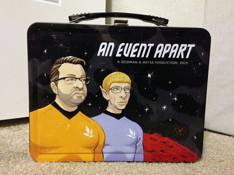
An Event Apart bills itself as “the design conference for people who make websites.” I attended last year, and was very fortunate to be able to attend once again this year. Here are my notes in their entirety from An Event Apart Boston 2013. My notes are grouped by talk, in the order that each talk happened at the conference.
Day 1: 6/24/13
Jeffrey Zeldman - The Ten Commandments of Web Design (zeldman.com • @zeldman)
Thou Shalt Entertain
- Take the opportunity to entertain when the situation would otherwise disappoint. (Example: entertaining 404 pages. “And why are we still calling them ‘404 pages’?”)
- Humanize the experience by adding little copy touches (e.g. the dynamic multi-lingual greeting on Flickr’s old site.)
Test Everything (Including Assumptions)
- Test your work on as many devices as possible (for example, by using tools from Adobe, or open-source tools like Remote Preview)
- Challenge your own assumptions, don’t work in isolation.
Thou Shalt Iterate
- Sometimes inspiration comes from just working a lot and being dissatisfied.
- “I move things around until they look right.” —Milton Glaser
Thou Shalt Ship
- If you can’t delegate at the pixel level, you’ll never ship.
- NOT shipping is great for consultants.
Engage Thy Community
- Interact with customers and humanize your company rather than just selling product.
- Embeddable comments drive traffic between your site and other sites while engaging the community.
Love Thy User As Thyself
- Just give the user what they want, where they want, without dumbing anything down.
Remember The Content And Keep It Holy
- Get the right content to the right user at the right time.
- Anything in the design that detracts from that should be cut; remove every distraction you possibly can.
Thou Shalt Make Magic
- Make magic. Don’t try for perfection.
- Instagram had a horrible web experience but was successful because they did one thing very well: their app.
Thou Shalt Prioritize
To Thine Own Self Be True
- Don’t make improvements for their own sake if they’re not really improvements.
- Don’t change for the sake of change, or try to be something you’re not, have a reason for every change you make.
This is design, not religion.
Jake Archibald - Rendering Without the Lumpy Bits (jakearchibald.com • @jaffathecake)
- Graphics performance: The new developer challenge.
- Until recently, the goal was for graphics performance to be usable (but not necessarily “good”).
- Browsers maintain a render tree that parallels the DOM. Changes to the render tree cause reflows.
- The render tree doesn’t perfectly parallel the DOM; it contains pseudo elements, shadow DOM, etc.
- 100ms total render time feels “instant” to a user.
- Layout thrashing is caused by querying/reading style attributes inside a loop that also changes style attributes.
- To prevent layout thrashing, query/read starting values outside loops.
- Scrolling isn’t necessarily expensive from a painting perspective; it just moves the viewport around what has already been painted.
- Fixed background images cause expensive repaints when scrolling—avoid them! Instead, use a background image that scrolls with the content to avoid repaints. (That may change since it depends on the browser implementation.)
- On mobile, native
clickevents have a 300ms delay since the browser waits to confirm whether the user is single- or double-tapping. Can work around this by:- Using
touchstart/touchendevents, but that may have unintended side-effects, unintentionally triggering those events when scrolling - Using a fixed viewport, which causes some browsers to intelligently disable double-tap detection
- Using the fastclick library
- Using
- For displays that refresh at 60 Hz, 16.67ms is the frame scheduling deadline.
setTimeout()isn’t accurate enough for animations (frame scheduling.)- Even with high frame rates, animations will appear jittery since the frames aren’t in sync with the refresh rate.
- Instead, use
requestAnimationFrame(), which has great browser support.
- 24 FPS content shown on a screen with a 60 Hz refresh rate causes 3:2 pulldown since every other frame is extended to three refreshes. (For 50 Hz refresh rate, 24 FPS video is shown at 25 FPS; it’s played slightly faster!)
- Software rendering caused the old “IE error effect”. Modern operating systems use hardware rendering.
- Let the browser use hardware rendering as often as possible:
- For the time being, use CSS 3D transform hacks where appropriate, but beware of the side effects, like hitting the GPU memory barrier on mobile.
- For CSS, animate using transforms instead of
left/top. - Animations using
left/toplook jittery since they snap to the pixel grid; transforms don’t snap to the pixel grid. - There are no magic rules around transforms and layering.
- Don’t trust performance tips, test everything yourself!
- Things that trigger new hardware rendering layers:
- 3D transforms
- Animation/transforms/opacity/filters
- Flash/Silverlight
- Canvas
- Video
- Fixed position elements (sometimes)
- Fixed backgrounds (soon!)
- Anything on top of a layer
Kevin M. Hoffman - Designing Meetings to Work for Design (kevinmhoffman.com • @kevinmhoffman)
- How do we collaborate better?
- Marshmallow Challenge team-building exercise: Of all age groups, Kindergartners are best at it because they spend most of their time doing rather than thinking.
- Don’t be afraid to fail.
- Rapidly iterate.
- Don’t plan, don’t discuss: just build (rapid prototyping).
- What’s better than hearing and seeing is discussing; a good meeting is an active discussion.
- Your ability to retain the most information is when you’re making and managing something.
- Doing is better than seeing, which is better than hearing.
- “If you’re not prepared to be wrong, you’ll never come up with anything original.” —Sir Ken Robinson
- Be wrong at the right time. Allow for failure in design meetings; that’s much better than failing after you ship!
4 frameworks for better design meetings
- Always diverge before you try to converge.
- Start the meeting with an opportunity for the discussion to expand, then arrive at a decision at the end.
- OARR: Outcomes, Agenda, Rules, Roles (David Sibbett)
- Employ the four roles that make meetings productive:
- Facilitator: Neutral, doesn’t evaluate or contribute ideas, just manages the meeting.
- Recorder: Creates group memory, records publicly, like on a whiteboard, is silent, and follows up afterwards.
- Group member: Contributes ideas, stays positive, isn’t defensive, checks/balances other members and the facilitator.
- Leader: Designs the meeting, selects attendees and roles, decides upon goals, and becomes a group member during the meeting.
- If you’re not in charge of the meeting, the biggest way to affect it is public recording. Volunteer to do it, you’ll help everyone in the room to be more productive and cut down on repeating themselves.
- Distribute/take turns in each role so everyone gets an equal opportunity to contribute.
- For small meetings, there’s no need for all roles, but someone should still serve as a facilitator/recorder.
- 3 questions of design: What has to stay the same? What can be changed? What can be eliminated?
- Instead of discussing, have everyone write their feedback on color-coded, groupable stickies; you end up creating user requirements/user stories just by virtue of going through that process.
- Employ the four roles that make meetings productive:
- Visual listening (via sketching) improves discussion and adds context.
- Visual memory and recall are powerful.
- Live-sketching a meeting could be useful; if you’re less artistically inclined, sketching your thoughts beforehand is also useful.
- Present and design ideas collaboratively.
- Do actual work in the meeting, don’t just talk about work.
- Example: When presenting personas, use something familiar like television characters rather than “generic” personas.
- Example: For designing responsive content strategy, label every piece of content on the page. Split the content into groups, and let teams of people rate the priority of the cards inside each group. That way you have a mix of perspectives ranking the importance of a distributed variety of content elements.
- Example: For designing interfaces, have small cross-disciplinary groups sketch as many concepts as they can. Then have groups repeatedly combine into larger groups and iterate on the design.
Luke Wroblewski - It’s a Write/Read (Mobile) Web (lukew.com • @lukew)
- The 5 most popular web sites in the U.S.—Facebook, Yahoo, AIM, Google, and YouTube—are all write/read experiences; they don’t work unless people add (write) content to them.
- All of those sites are now moving to mobile.
- “The mobile moment”: When the amount of your mobile users becomes larger than the number of your non-mobile users.
- It’s a myth that mobile devices aren’t used for creating content. In 2011, 40% of tweets were created on mobile, and 3 hours of video per second were uploaded to YouTube via mobile.
How do we design for mobile creation?
One-handed Use
- Test with one thumb!
- iOS 7 will have improved gestures for single-thumb use.
- “What we need to do to design is to look at the extremes. The middle will take care of itself.” —Dan Formosa
- Think about how the keyboard can be avoided at all costs. Don’t let the keyboard appear unless there’s no other way.
- Use smart defaults and suggestions to avoid making the user type manually.
- Let people type manually if they really want to.
Visually Engaging
- Images rule on mobile (and not just in social apps!)
- Images are one of the best mediums for communication on mobile.
- Imagery has a huge impact in commerce (eBay, hotel booking, etc.)
- Performance is still important: We should work hard to keep things visually engaging without impacting performance.
Focused Flows
- The user should have to do as little work as possible to accomplish a core task (Examples: Foursquare check-in, booking a hotel, etc.)
- “Creativity is people who care enough to keep thinking about something until they find the simplest way to do it.” —Tim Cook
- “Booking a hotel happens in 3 taps and a swipe. This is a competitive advantage.” —Sam Shank, CEO of HotelTonight
- It takes big changes to go small.
- Yelp doesn’t allow users to write reviews from mobile since they view their users through the lens of the desktop; they’re worried users will write reviews using “SMS writing”.
- HotelTonight allows users to write reviews using photos rather than typing them out.
- If you’re making a lot of people uncomfortable with a big design decision, you’re probably on the right track.
Just-In-Time Actions
- “Intro tours” aren’t the best way to communicate how to create/make things in mobile apps. Instead, teach people in context using just-in-time education.
- Show help or relevant actions when they’re needed rather than bombarding the user with all possible actions at once.
- Example: When and if you’ve recently taken photos, the Google+ app shows recent photos for easy posting.
- Example: When you start scrolling down in the Google+ app, the navigation bar jumps out of the way (but come back when you start scrolling back up.)
Cross Device Usage
- Multiple devices can be used together for a cohesive input experience.
- Access: Native apps vs. mobile web apps? They’re not necessarily opposites; use both at the same time. They can play off each other’s strengths.
- Flow: Allows a process to travel across screens. (Example: Google Maps iOS and web apps share recently-entered data, eBay allows you to start creating a listing on one device and complete it on another.)
- Control: One device can control another. (Example: OneID)
- Push: One device sending something to a different device. (Example: eBay allows users to add a photo from a mobile device when creating a listing using the desktop web site.)
Jason Grigsby - The Immobile Web (userfirstweb.com • @grigs)
- Televisions are the next wave in the “device zombie apocalypse.”
- Televisions allow for cohesive experiences while using mobile devices. (Example: Game of Thrones shows extra info on SmartGlass.)
- Big opportunity: An App Store on Apple TV.
- The browsers built in to the newest televisions are actually surprisingly good; they pass HTML5/CSS3 tests.
- The user experience of browsing the web on televisions is horrible; the biggest problem is input.
- Two main methods of input for smart TVs: D-pads and pointers.
- D-pads work very well when done properly. D-pads should not be used to control cursors.
- Pointers work well with cursors, but precision is difficult.
- Gesture controls currently don’t work very well.
- Remote control design is still evolving (touch areas, etc.)
- Context is irrelevant for mobile users since we can’t know what it is, but context is becoming relevant for television.
- Designs for 10-foot UIs should be task-oriented.
- Hover is dead for mobile devices, but is back on TVs (for cursor input.)
- Arbitrary CSS or JavaScript is still necessary to aid with input on televisions.
- Televisions have inconsistent resolutions and overscan.
- We need to put pressure on television browser makers to interoperate.
- We still need to rely on device detection for the time being.
- You can test designs on mobile devices at cell phone carrier stores, but can’t do the same for smart TVs since none of them have remotes or a wi-fi connection at stores.
- What are people actually expecting when they buy a smart TV?
- Storage capacity and processor speed aren’t listed as specs.
- Do most people just want built-in Netflix?
- Are televisions the equivalent of cell phones before the iPhone?
- Smart TVs suck right now, but it would be dangerous to dismiss them.
- We can’t predict future behavior from a current experience that sucks.
Ethan Marcotte - The Map & The Territory (ethanmarcotte.com • @beep)
- Responsive designs use a fluid grid, flexible images, and media queries.
- Converting a fixed grid to a fluid grid: target ÷ context = result
- Media queries are sized to arbitrary
emunits based on readability, not screen/device measurements. - Across different resolutions (media queries), you can re-use the same navigational elements by repositioning them using absolute positioning. (Example: An element that is shown inside a submenu at small sizes can be repositioned into the main masthead at larger sizes. The basic functionality and markup don’t change between display sizes.)
- Average page weight was 320 KB in 2009, and 1.4 MB in 2013. Over four years, average page weight has increased 400%.
- “The more accurate the map, the more it resembles the territory. The most accurate map possible would be the territory, and thus would be perfectly accurate and perfectly useless.” —Neil Gaiman, American Gods
- 7 billion mobile subscriptions in 2013, 60% are on EDGE/CDMA.
- Sustainability in web design:
- Reduce: Reducing page weight can open your site to new markets. Use the smallest possible JavaScript libraries.
- Revisit: Revisit some of our old assumptions about design. The web is a new medium that needs a new aesthetic.
- “‘We don’t have any non-JavaScript users’ No, all your users are non-JS while they’re downloading your JS” —Jake Archibald
- “What works good is better than what looks good, because what works good lasts.” —Ray Eames
Day 2: 6/25/13
Karen McGrane - The Mobile Content Mandate (karenmcgrane.com • @karenmcgrane)
- “There is no reason for any individual to have a computer in his home.” —Ken Olsen, CEO of Digital Equipment Corporation
- “There is no reason anyone will need to do that on mobile.” —Your company, probably
- How could cheap PCs compete with minicomputers from DEC, the world’s second largest computer company in 1988?
Disruptive Innovation
In industry after industry…the new technologies that had brought the big, established companies to their knees weren’t better or more advanced—they were actually worse. The new products were low-end, dumb, shoddy, and in almost every way inferior. But the new products were usually cheaper and easier to use, and so people or companies who were not rich or sophisticated enough for the old ones started buying the new ones, and there were so many more of the regular people than there were of the rich, sophisticated people that the companies making the new products prospered.
—The New Yorker, When Giants Fail
- Examples:
- Handcrafted, high-quality 1940s cabinet radios were replaced by cheaper, lower quality portable transistor radios.
- Offset printers were replaced by cheap inkjet printers.
- People predicted that digital cameras would disrupt the film industry, but nobody predicted that digital cameras would disrupt the entire camera industry (cameraphones, etc.)
- We’re currently experiencing the next great wave of computing.
- Mobile devices are becoming a personal computing device for people who have never had access to the Internet before.
- The iPhone was originally seen as a luxury, high-end cell phone as opposed to a really cheap computer.
The Mobile-Only User
- Mobile phones and smartphones are not two different segments of the market, just like there weren’t two markets for color vs. black-and-white televisions.
- Lots of minority groups don’t have access to the Internet or broadband at home, but nearly everyone has a phone.
- Lots of minority groups only (or mostly) use the Internet on mobile.
- “Mobile-optimized” sites usually have a paltry subset of the content of the “full desktop” version. This crutch has gotten us through the last five years of mobile adoption, but this isn’t good enough.
- We can’t force users to pinch-and-zoom their way around desktop sites on a mobile device. (“It’s like reading a newspaper through a toilet paper tube.”)
- Mobile users are being treated as second-class citizens since web designers expect that people will use the “real web site” on a desktop PC.
Content Strategy for Mobile
Know Your Workflow
- There shouldn’t be separate “mobile” and “web” content teams.
- Don’t fork your content for mobile: You would have to maintain and update two independent but similar pieces of content.
- Being forced to be succinct sometimes makes existing mobile web sites better and easier to read than their desktop counterparts. If the mobile site is better, why isn’t it the site for everyone?
- There’s no such thing as “how to write for mobile”; there’s just good writing!
- Good content transcends platform. If you have interesting, well-written, appropriately structured content, it will easily make the link to mobile. (Example: American Cancer Society web site.)
Chunk Your Blobs
- Content shouldn’t be specifically associated with any part of the layout of a web page.
- Which content should be included or excluded?
- Should longer pages be broken into shorter ones?
- Will it work to reuse headings as links?
- Will it work to truncate body copy for teasers? (Example: This doesn’t work for Amazon’s mobile site; the truncated body copy has no value since product names and specs are just repeated.
- Responsive design won’t fix your content problem.
- The Daily Beast, NPR, and The Guardian truncate headlines rather than giving them proper real estate on mobile. (http://guardiantruncationteam.tumblr.com)
- Either give headlines more real estate, or write shorter headlines.
- Netflix is a great example of chunked content—it is available on hundreds of devices but they never truncate content; they show the appropriate amount of detail/content for a given platform.
In Conclusion
- Don’t create content for a specific context.
- You don’t get to decide which device people use to access your content; they do.
- Disruptive technologies eventually get good, or they redefine what good means.
- Do mobile right, right from the start.
Eric Meyer - Strong Layout Systems (meyerweb.com • @meyerweb)
- When it started out, CSS was an appearance system, not a layout system.
- CSS1 had floats, but they weren’t meant to be used for layout.
clearis the only reason we used floats for layout, otherwise we would have stuck with tables. - “
clearwas a screwdriver we used to pound in a nail since no one had given us a hammer yet.” - CSS2 added positioning, which helped slightly with layout. Wired.com had a 3-column layout in 2002.
- Design decisions were made in the context of the limitations of the technology.
- We’ve internalized the limitation that positioned/floated elements are only as tall as their content and that “float drop” can happen.
- The old limitations of CSS have limited the scope of our perceived design choices/toolbox; unlearning these limitations and assumptions will become a vital skill.
Viewport Units
- http://www.w3.org/TR/css3-values/#viewport-relative-lengths
- Viewport units look similar to percentage units but they’re not. Percentage elements size relative to their parent element while viewport elements size relative to the viewport.
Flexbox
- http://www.w3.org/TR/css3-flexbox/
- Reminiscent of table layouts but much more powerful.
justify-contentandflex-wrapreplace the need to do width/margin/wrapping calculations.- Allows you to mix units (two elements that are placed next to each other can have different units.) The space between them isn’t margin or padding, it’s just available space not yet “eaten up” by the flexbox algorithm.
display: flexmust be applied to the parent element of whatever elements you want to be flexible.- Flexible elements can be rearranged at will with
order. Regardless of order, selectors (:first-child,:last-child, etc.) will still respect the DOM and ignore the flex flow. - There’s nothing stopping an element that’s flexible from also being the master context for its own flexible children.
Grid Layout
- http://www.w3.org/TR/css3-grid-layout/
- Browser support isn’t great yet, since the standard is still being [re]written.
- Grids can be nested, and mixed and matched with flexbox.
- Simple syntax (but simple doesn’t necessarily mean easy!)
Regions and Shapes
- http://www.w3.org/TR/css3-regions/, http://www.w3.org/TR/css-shapes-1/
- Regions separate layout from content by allowing content to flow between elements.
- Not the web as we’re used to it, but may become the web as we’re used to it very soon.
- Can combine regions and shapes to mimic complex print layouts.
Lea Verou - Deep CSS Secrets (verou.me • @LeaVerou)
Interactive slides are available at http://lea.verou.me/more-css-secrets.
background-attachment: local;
- Background scrolls with the page and with the element.
- Can be used to implement “more content” indicators inside scrollable areas à la Google Reader: can be applied to elements that block the “more content” indicators when scrolled to the top or bottom of a scrollable area.
- Decent browser support (except Firefox).
- http://lea.verou.me/2012/04/background-attachment-local/
Fixed Width, Fluid Background
- An effect where the background resizes but the content width is fixed.
- You don’t need wrapper elements and inner elements with margins, just use
paddingwithcalc. - Decent browser support for
calc(except Opera).
Lightboxes
- An effect where an image is displayed by expanding the width and then the height.
- Combine independent CSS transitions for height and width, and add a delay the 2nd transition.
- Can exploit the fact that the CSS
transitionproperty itself does not transition. - Decent browser support for CSS transitions.
Lined Paper/Zebra Striping Effect
- Create a background by tiling a linear gradient. Space the tiling using the
line-heightof the text. - Can also make the background lines respect padding by using the
background-originproperty (background-origin: content-box;) - Can also use the same principles to zebra-stripe text, without needing wrapping elements for each stripe.
- Decent browser support for
background-origin.
Diamond-Outlined Images
- Wrap an image with a wrapping element, rotate the wrapping element by 45 degrees, then rotate the image -45 degrees.
- Rotation is achieved using CSS transforms.
- Decent browser support for CSS transforms.
Make Elements Trace a Circular Path
- One solution: Make a wrapper element trace a circle using CSS animation and
transform-origin, then counter-rotate the original element so it always faces the same direction while tracing a circular path (doesn’t rotate in place.) - Optimize by reusing the same
@keyframesfor both animations, but reverse one animation withanimation-direction. - Multiple transforms layer on each other; transforms stack on top of any changes caused by the previous transforms.
- Decent browser support for CSS animations.
Non-Boxy Shadows
- Use
filter: drop-shadowinstead ofbox-shadowto draw shadows behind irregularly shaped elements (like speech bubbles). - Can use SVG filters for browsers that don’t support CSS filters.
- Poor browser support for CSS filters.
Glass Pane Effect
- Text written inside a “glass pane” element positioned over a background image is hard to read. How do we blur the background of the glass pane without blurring the text?
- Add a
:beforepseudo-element to the glass pane, give it the same background image as the preexisting background image, and blur it usingfilter: blur. - Allows you to not need an alternate pre-blurred version of the background image.
- Messy background positioning unfortunately still applies.
- Degrades gracefully for browsers that don’t support CSS filters—the image will just be transparent instead of blurred.
hyphens Property
hyphens: auto;makes justified text much more readable; eliminates ugly whitespace rivers.- Poor browser support for the
hyphensproperty.
Frame Animations
- An effect that achieves animation by manipulating the background position of an image that contains frames.
- Use
stepswith CSS animations to do discrete easing rather than continuous easing. This shows each frame in succession instead of continuously sliding the background image. - http://lea.verou.me/2011/09/pure-css3-typing-animation-with-steps/
- http://jsfiddle.net/simurai/CGmCe/light/
Kim Goodwin - Silo-Busting with Scenarios (@kimgoodwin)
- Organizing teams by platform/geography/features limits those teams’ worldviews.
- Example of an agile user story: “As a user, I want to log in to access my account.”
- When has a real user said, “Gee, I want to ’log in’?”
- We all fall victim to having siloed mindsets, even for low-level functionality.
- A scenario is a plausible future story about a persona using the product or service from start to finish.
- Scenarios involve and star human characters, not just roles (“user” or “admin” are just roles.) We’re people, not roles.
- Good process oscillates between generative (divergent) and analytical (convergent).
- First rule of user research: Forget what you’re building since that will make you think much too narrowly.
- User research can clarify and expose information about the big picture and the problem you’re trying to solve, rather than just what you’re building.
- Create a journey map—what frustrates the user during the entire process of achieving their own goals?
- After that, what can we do to “un-suckify” the worst part(s) of the experience?
- Just like you wouldn’t call a good restaurant “really edible”, good usability isn’t good enough—we have to go out of our way to delight users. “Our job is to be delightfulness experts.”
- Add something unexpectedly good. What would a helpful human do?
- Make it a story.
- Once all of the information is collected, discuss and decide on priorities with stakeholders.
- Look at your silo, informed by the bigger journey.
- Use scenarios to guide rough storyboards: What’s on the screen and how it’s laid out. Don’t stress about widgets and words.
- Look for convergence between scenarios, but prioritize as you converge.
- Scenarios drive site structure.
- Polish the details.
- Avoid UX purgatory.
- Good experiences only happen when everyone who is responsible for part of the experience is invested in creating the whole experience.
Mike Monteiro - What Clients Don’t Know (and Why It’s Your Fault) (mikemonteiro.com • @Mike_FTW)
- Designers: You are in the service industry! You have clients and they need your help.
- We get irritated by having to explain what is second nature to us.
- To those on the outside, the process of buying design is as mysterious as making it. It’s all magic.
- If you’re a designer, you’re in the confidence game.
- Designers need to have empathy for clients.
- Your job isn’t just making things, that’s the easy part! It’s convincing people that the shit you thought up in the shower that morning is right.
- If it helps you do your job, it’s part of your job.
- Don’t work with anyone you can’t respect, since you won’t be able to empathize with them.
- Put yourself in your clients’ less stylish shoes.
- You can’t change how others behave, but you can change how you behave and react to a situation to meet a common goal.
- Clients don’t know when to get a designer involved.
- “‘Creative’ is a hate word. My mother raised three kids on a seamstress’s salary—THAT’S creative.”
- “As long as you act like a disenfranchised ‘creative,’ that’s how you deserve to be treated.”
- Eye rolling is not a design skill.
- Complaining is not a design skill.
- “They never asked me” is not a design skill.
- Stop waiting for an invitation to do your job—assert yourself.
- Clients don’t know the best way to evaluate a designer.
- Clients don’t know how to read your portfolio—the work does not speak for itself.
- Retail suit store: “Don’t sell the suit, sell the service.”
- “Sell [clients] the services you provide, using your sites as props.”
- Be upfront and let clients know if you’re not the right person for the job.
- Referrals are awesome—if you get a referral, it means you’re not an asshole. Nobody is going to put someone they know in the hands of an asshole.
- Every job you do is a sales pitch for the next job.
- RFPs may be a client’s way to tell you that they’re scared.
- On fighting with clients about RFPs: “As long as we keep doing it, no one is going to stop expecting it.”
- Pick up the phone.
- Learn to say no.
- Learn to ask why.
- Learn to say I don’t know.
- Clients want reassurance that they’ll be in good hands with you, so they ask for the one thing they’re familiar with—the outcome! “Let’s have them do comps!”
- As a designer, it’s your job to walk them back from that conclusion and figure out the issue they’re trying to solve.
- “The process you have that gets you from one point to another is only as good as your willingness to stand up for it.”
- “Show the client they’re in good hands, not by reacting to their request, but by addressing the fear behind that request.”
- “Never work for someone you can’t argue with. Show clients you’re not going to let anyone mess up the process, even them.”
- Clients don’t know why things cost what they do.
- Design is a solution to a problem within a set of constraints.
- “Your budget is one of the most important constraints there is. Don’t make it a secret, make it a data point.”
- Clients don’t know what the process looks like.
- Your process is a mystery. Clients don’t want to think about it.
- Clients deal with the unknown by applying their own process, which is comfortable and familiar to them.
- Do everything in your power to be right, but never be afraid to be wrong.
- Letting a client tell you how to do your job is stupid. “Nature abhors a vacuum. So do clients. They will fill it.”
- It’s not their job—it’s yours!
- Never, ever, ever throw another designer under the bus to advance your own agenda. (“You should clap for that!”)
- No one is born a good client, just like no one is born a good designer.
- A doctor wouldn’t be able to have a conversation with you about an ailment on par with how he would converse about it with another doctor.
- “Please take all my clients from me.”
- You are a terrible mind reader.
- “‘Hope’ is not a design word. ‘Empathy’ is.”
- The way to become a better designer is to help clients become better clients.
- You are not a pixelpusher.
- You are responsible for what you bring into the world.
- Everything that’s wrong with design today is your fault—and that is good news!
- Working together with mutual respect can fix any problem you set your mind to.
Jared Spool - It’s a Great Time To Be a UX Designer (uie.com • @jmspool)
- Design is the rendering of intent.
- Intention falls on a scale that spans from imitation to innovation (and corresponding expense, risk, and value.)
- Business wins when it is intentionally innovative, and when it values designers.
- Example: Airbnb ousted Craigslist for vacation rentals, which itself ousted newspaper classified ads.
- Design is no longer about the visual; it’s about the business.
- Great business models are intentionally designed. (Example: Apple’s end-to-end manufacturing, distribution, and sales.)
- “The largest room in the world is the room for improvement.”
- On Apple: “How cool would it be to have ‘Genius’ on your business card? That would totally change Thanksgiving.”
- Innovation is not adding new invention; innovation is adding new value.
- Experiences can be mapped, measured, and designed. What do we intend?
- Experience design: The rendering of intent within the gaps. (Example: GE Adventure Series)
- Old Chinese proverb: Be careful what you ask for, lest it become so.
- The best designers are good at storytelling, critiquing, sketching, presenting, and facilitating.
- Specialists have more expertise in one area over others, generalists have equal expertise in most areas. Compartmentalists have expertise in a single area.
- Teams need generalists more than specialists. Compartmentalists are the least valuable—being a compartmentalist is a career-limiting decision.
- Experience designer: also known as a unicorn. (People don’t believe they exist.)
- How do you make a unicorn?
- Train yourself
- Practice your skills
- Deconstruct as many designs as you can
- Seek out feedback (and listen to it)
- Teach others (you learn something when you teach something)
- The unicorn is design’s most important innovation.
Conclusion
Interestingly, my takeaways are almost identical to last year’s (mobile, mobile, mobile!):
- Design a single experience that works well on mobile and on the desktop (mobile-first, responsive.)
- Let mobile be the measuring stick for your content—if you don’t need it on mobile, do you need it at all?
- Since mobile and desktop should be a single experience, they should have complete content and feature parity.
- Performance (speed and data usage) is important, especially on mobile.
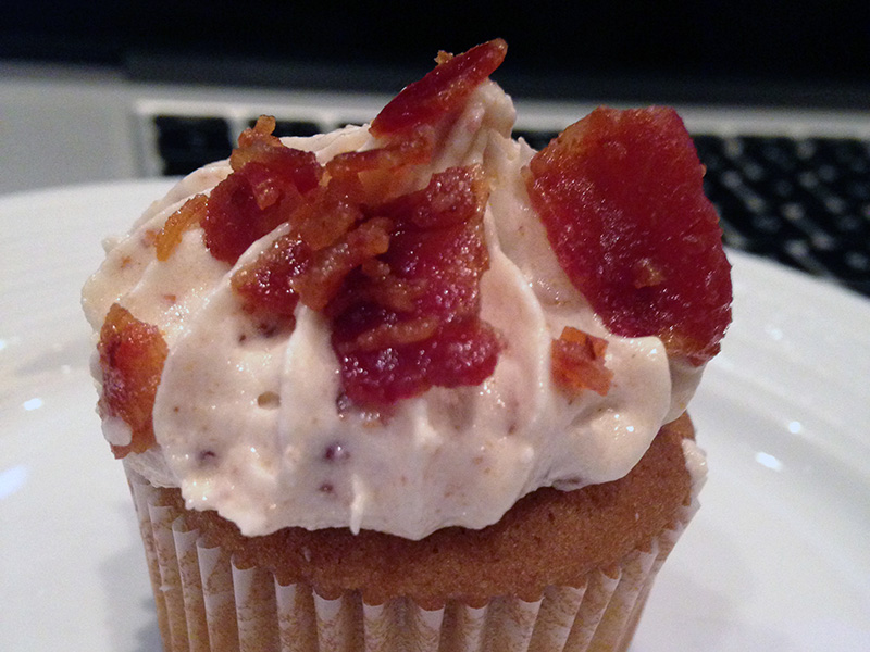
As a bonus, I also concluded that bacon cupcakes actually exist, and are in fact delicious:
Just like last year, An Event Apart was extremely well-organized, informative and inspirational, and I’m very glad that I was able to attend!