 Josh Dick
An Event Apart Boston 2015
My notes from An Event Apart, "the design conference for people who make websites".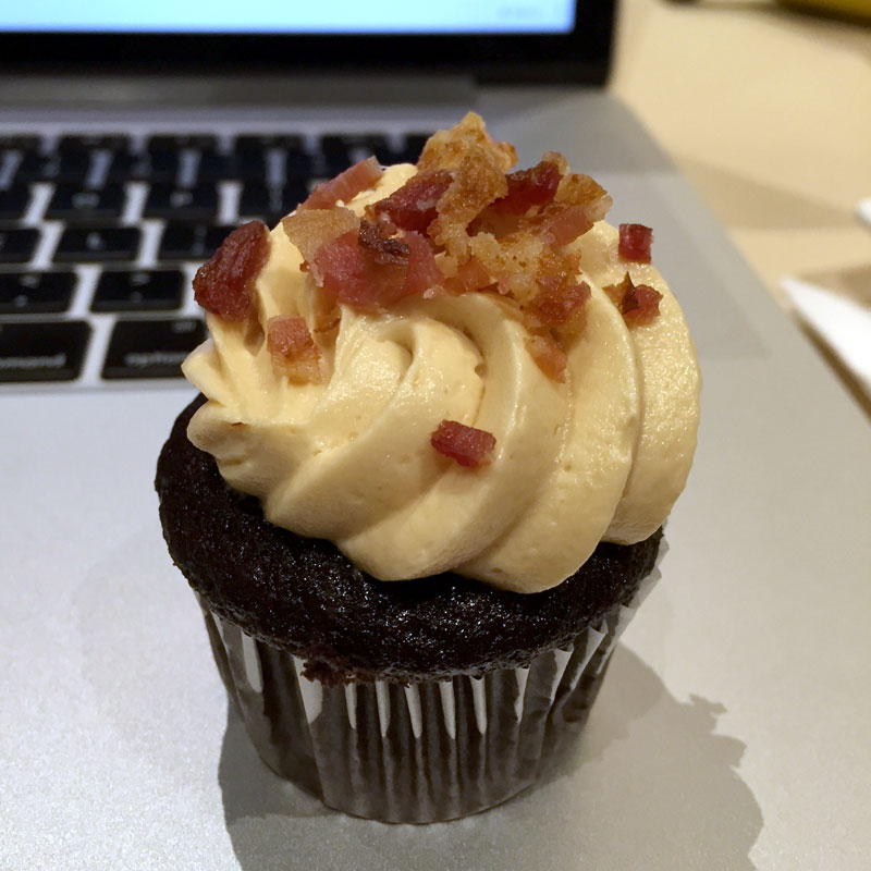
Introduction
I had the privilege of attending An Event Apart, “the design conference for people who make websites”, for the fourth time. My notes from An Event Apart Boston 2015 follow this introduction. The notes are grouped by talk, in the order that each talk happened at the conference.
If you’re interested, my notes from An Event Apart Boston 2014 are also available.
Day 1: 5/11/2015
Jeffrey Zeldman - The Fault, Dear Brutus (or: Career Advice From a Cranky Old Man) (zeldman.com • @zeldman)
- “When I get stuck in a rut, I decorate it.”
- Work never sells itself. You need a strategy to sell.
- “Every client wants something nobody’s done before that has worked at least three times for other people.”
- In big companies, politics trumps work.
- Attitude trumps work in most companies. Being indignant is not a good career move; attitude is everything.
- First impressions are forever.
- You are what stands between you and success: “We have met the enemy and he is us.” -Pogo
- Dare to speak. Unlock your inner voice! (Blogging, Dribbble, Behance, GitHub, Codepen, etc…) Blogs and side projects can show how you think and what you do, even if your regular work can’t (or you’re not allowed to share your regular work.)
- “When you pick a typeface, your design is halfway done.”
- Don’t wait for someone to hand you your dream job or project – make your own.
Jon Hicks - Icon Design Process (zeldman.com • @hicksdesign)
- Never use color alone to signify meaning.
- Why make your own icons instead of using a royalty-free icon set?
- Not the right size
- Not the right style
- Too many ‘spare’ icons
- Not the right icons (for a specialized application, like GitHub)
- There are two main types of icons: iconic and symbolic. Iconic icons resemble real things; symbolic icons don’t (their meaning is learned.)
- Iconic icons are easier/faster to recognize than symbolic icons.
- Embrace conventions! Don’t use a welcome mat icon to represent “home”.
- The Noun Project
- Research local knowledge: A piggy bank, a thumbs up, and an owl have different meanings for different cultures.
- It’s possible to be too simple: Icons for a padlock, a shopping bag, and a 10-ton weight can look more or less identical in the absence of context (text labels) or extra visual details.
- Whatever you use, decide:
- Size(s)
- Style
- Final Export Format (SVG)
- Work on all icons together; use a grid to size/align/balance all icons.
- Antialiasing can get in the way sometimes; an odd-number-sized grid can help with this.
- Optimize SVG files with svgo
- Icon fonts vs. SVG:
- Why use icon fonts?
- Scalable
- Small files
- Easily styled with CSS No sprites
- Supported in IE4+!
- Why not?
- Fiddly process
- No meaning
- Only monochrome
- No font = no joy
- Rendering Inconsistencies
- No meaning?
- Why use icon fonts?
- Grumpicon: Generate cross-browser iconsets from SVG, with appropriate fallbacks.
- SVG elements can reference each other, which allows a single SVG path to be reused and thus drawn with different CSS styles/sizes/etc. without duplicating the path.
Sarah Parmenter - Designing for Social Behavior (sazzy.co.uk • @sazzy)
- “Whenever I hear the phrase ‘Social Media’, I think ‘Social Mediblah’ instead.”
- Social media is a tool to make something happen.
- An effective social media campaign is based on the psychology of social behaviors, not current technology. –Media Psychology Research Center
- The basic social ecosystem (your persona and tone of voice) includes 4 channels:
- Publishing channels
- Aspirational/inspirational
- Support channels
- Follow up channels
- To survive, a [social] mobile app must have razor-sharp focus on doing just one thing.
- With Facebook advertising, you are the product: You need to pay to access the followers that you’ve worked to build up.
- What people use “liking” for:
- Acknowledging that someone has seen/read something without explicitly leaving a comment
- Using as a “read” flag, like e-mail
- Why do people comment on a photo that already has 129,000 previous comments? Tribe behavior. It’s like shouting at a sports event. #aeabos –@zeldman
- Tribe mentality is a key ingredient to both online and offline design.
- Give anyone long enough, and they’ll work out how to game the system.
- Social media calls for authenticity: it cannot be faked.
- The lightbulb moment: Don’t do the safe/expected thing, be prepared to have difficult conversations. If you can’t, it will limit your ability to do good work.
Josh Clark - Magical UX and the Internet of Things (globalmoxie.com • @globalmoxie)
Act I: Magic & Technology
- “Any sufficiently advanced technology is indistinguishable from magic.” –Arthur C. Clarke
- “One goal: The computer disappears into the environment.” –Alan Kay
- The phone is the first Internet of Things device for everyone (sensors + smarts + connectivity.)
- Mobile phones bring computing power to immobile objects.
- Embed smartphone brains in anything. Example: Nappy Notifier: Get a push notification when your baby’s diaper is wet.
- “We have centuries of experiencing imagining what objects could do for us if they were just…smarter.”
- bt.tn and flic.io connect to ifttt and Zapier
Act II: Physical Meets Digital
- Physical interaction with a digital API.
- The world is the interface…like it always has been!
- The world is a data source. Example: Snapshot by Progressive Insurance/Automatic use cars’ OBD-II ports to collect data.
- The world is reactive – intentional interfaces that extend our will. Example: Ares Sand Table
- The world is a big canvas.
- What if we stop focusing on wearables, and instead think about “thereables”, adding intelligence to objects that are already in the world? Why isn’t your bed a sleep tracker, instead of something like a FitBit?
- The world has depth and mass. Physical objects can act together and be aware of each other across a digital space. Example: MIT Thaw
- This is not a challenge of technology. It’s a challenge of imagination.
Act III: Magic, Imagined
- Google Glass asked, “What can we do with technology on your face?” It should have asked, “What if this thing was magic?”
- Design for the thing’s essential thingness. Make things more like they are (and make ourselves more human), not just more technically impressive.
- Bank on illusion. Embrace misdirection. Example: Samsung’s electric cooktop has flame-like LEDs since that gels with a user’s mental model of a hot stove.
- Vessyl has amazing technology but doesn’t actually add value.
- Don’t just add data; add insight. Can you imagine if every object in your house was giving you constant status updates?
- Expose as little technology as possible.
- Be a little bit ridiculous. Examples: Sharknado + Philips Hue and ThinkGeek’s Mega Stomp Battle.
- “The future of technology has always looked like a pretty toy to people comfortable with the past.” –Benedict Evans
- People fear that magic always goes wrong: “How smart does your bed have to be before you are afraid to go to sleep at night?” –Rich Gold
- Build systems that are smart enough to know they’re not smart enough.
- Make technology invisible and humane.
- It’s not “Can we?”, it’s “How will we?”
- The “Internet of Things” is not about the thing. The technology should amplify our humanity.
Mat Marquis - Smaller, Faster Web Sites (matmarquis.com • @wilto)
- Users just want to keep their coffee off the floor, they don’t care about the table.
- When we value convenience over craft, we’re designing a web for ourselves, not for users.
- We’re building the IKEA web: easy to build, but uncomfortable to use.
- 20% of US users depend on smartphones almost exclusively for the Internet.
- Average page weight is 1944 KB – mostly images.
- The right image size(s) for the right device: Serve responsive images with the
srcsetattribute and the<picture>element. - Use picturefill for legacy browsers that don’t support the
<picture>element. - SVG is widely supported, but still doesn’t work on Android – a huge number of Android devices still ship with 2.3 today!
- “It seems every year one of us accidentally discovers another game-changing thing that SVG has been able to do since 1987.” –@ScottJehl
- ~14 KB included in initial TCP/IP connection, so critical CSS should be at the top of the page.
- http://npmjs.com/package/grunt-criticalcss
- https://github.com/filamentgroup/loadcss
- Can also use this to defer loading of webfonts.
- Set a performance budget! Validate it with Grunt: https://www.npmjs.com/package/grunt-perfbudget
Ethan Marcotte - Laziness in the Time of Responsive Design (ethanmarcotte.com • @beep)
- Categories like “tablet” and “mobile” are so broad as to be completely unhelpful as they pertain to our work.
- “My anxiety doesn’t come from thinking about the future, but from wanting to control it.” –Hugh Prather
- Stop trying to perfectly control rendering on every device and platform.
- Avoid describing ideal layouts in markup; it gives you more flexibility in the long run.
- “Instead of solutions for problems, [systems] for solutions: for no problem is there an absolute solution. There is always a group of solutions, one of which is the best under certain conditions.” –Karl Gerstner
- Making it fit is the baseline. How can we make it feel at home?
- Start designing from a network of small layout systems and scale up from there.
- Responsive navigation:
- Off-canvas
- Off-canvas navigation triggered by ’the hamburger’ (☰ → ☰) hasn’t been as successful as most of us think.
- The hamburger’s function is not always self-evident.
- We don’t always need to have the default expectation that navigation should be concealed on mobile.
- We’re shoving our mess under the bed that is the off-canvas hamburger navigation menu on mobile.
- A lot of the needless complexity we foist on our responsive navs comes from thinking about them as desktop-first.
- We should look for opportunities to be just a little lazy – maybe it’s about a conservation of effort.
- Design the transaction, not the interface.
- A well-crafted responsive design is device-agnostic.
- “There’s more to devices than the size of their screens. A device-agnostic approach also takes into account infinite combinations of screen resolution, input method, browser capability, and connection speed.” –Trent Walton
- “Like cars designed to perform in extreme heat or on icy roads, websites should be built to face the reality of the web’s inherent variability.” –Trent Walton
Day 2: 5/12/2015
Eric Meyer - Designing for Crisis (meyerweb.com • @meyerweb)
- “You don’t get to decide what your users will want to do on mobile. They do.” –Karen McGrane
- Add another persona to your list: the user in crisis, who can barely think straight. (Example: Confusing, cluttered hospital web site.)
- Empathy is a core design skill.
- When usability testing a design for people in crisis, add confusion/annoyances to the page to suck up mental resources, to make sure the design still works. (Blurred text, shaky page, transposing text, etc.)
Rachel Andrew - CSS Grid Layout (rachelandrew.co.uk • @rachelandrew)
- Seeing Flexbox as the silver bullet for layout issues is likely to lead us down another path of layout hacks.
- Flexbox is designed for things that can be represented as a single, unbroken line, not grids.
- CSS Grid Layout to the rescue: http://gridbyexample.com/
- CSS Grid Layout is useful as a prototyping tool even though browsers aren’t [yet] ready to use it in production.
- Bootstrap and similar frameworks rely on describing the layout in the markup.
- With CSS Grid Layout, we describe the layout in the CSS and can redefine that description at any breakpoint.
- We can even use CSS Grid Layout to recreate a Bootstrap-style 12-column grid, without needing to describe the grid in the markup.
- CSS Grid Layout allows cells to be spanned vertically, eliminating the need for nested grids.
Brad Frost - Atomic Design (bradfrost.com • @brad_frost)
- We’re not designing pages, we’re designing systems of components. –Stephen Hay
- Potential pitfalls with web frameworks:
- One-size-fits-all
- Lookalike issues
- Might not do everything you need
- Compatibility with existing sites
- Subscribe to someone else’s structure, naming, and style
- ☛ Atomic design = creating pattern library/style guide first, instead of cherrypicking patterns after design. @brad_frost #aeabos –@zeldman
- Responsive deliverables should look a lot like fully-functioning Twitter Bootstrap-style systems custom tailored for your clients’ needs. -Dave Rupert
- Benefits of front-end style guides:
- Promotes consistency and cohesion
- Easier to test
- Better workflow
- Creates a shared vocabulary
- Useful reference
- Future-friendly foundation
- Getting started with style guides:
- Example style guides:
- Atomic design tool: http://patternlab.io/
- Frontend development is part of the design process.
- Collaboration and communication trump deliverables.
Derek Featherstone - Content in Context is King (simplyaccessible.com • @feather)
- Great experiences are heavily based on context.
- Context is often seen as “the device someone is using”, but context is actually:
- Time
- Location
- Proximity
- Device
- State of mind
- Capabilities
- Activity
- Interests
- Interaction
- Content priority changes with respect to time. Example: Showing a conference schedule front and center on its web page while the conference is actually occurring.
- Programmatically change content priority over time. This applies to almost any industry.
- Content priority changes with respect to location. Example: For a college web site, show directions to the college if you’re not present on campus, or an internal campus map if you are.
- Content display also changes with respect to location. Example: Date picker starting on Sunday if you’re in the US, Monday everywhere else.
- Content changes with respect to proximity.
- All saved context must be resettable.
Kate Kiefer Lee - Touchy Subjects: Creating Content for Sensitive Situations (katekieferlee.com • @katekiefer)
- Sensitive topics and industries:
- health and medicine
- money and banking
- private information
- fundraising
- religion
- politics
- Urgent messages:
- error messages security notifications
- warnings and compliance alerts
- rejection notices
- apologies
- Less urgent messages:
- help docs
- customer service emails contact pages
- forms
- unsubscribe pages
- legal policies
- Principles:
- Be clear
- Get to the point
- Stay calm
- Be serious
- Accept responsibility
- Be nice
- “It is insight into human nature that is key to the communicator’s skill. For whereas the writer is concerned with what he puts into his writings, the communicator is concerned with what the reader gets out of it.” –William Bernbach
- “A good teacher I know, Jenifer Auger, has a simple but effective technique for the writing classroom. When her students have blah voiceless writing, she makes them speak the following words to her before reading their text: ‘Listen to me, I have something to tell you.’” –Peter Elbow
- Read it out loud!
- Know when saying nothing is best: “Brands are not people. Customers are not close friends. And boundaries need to be maintained.”
- Pick the right tone to match the reader’s feelings based on the content type.
- “New Yorker: “We screwed up.” Airline: “We apologize for any inconvenience this may have caused.” Which apology is more effective? #aeabos” –@zeldman
- Legal documents can use plain language, as long as the tone is appropriate.
- Prepare for the worst ahead of time: Create templates that can be used for responding to unexpected situations, keeping in mind:
- Possible content types (email, tweet, blog post, etc.)
- Apologize up front if necessary say what happens next
- Who the message will be from who needs to sign off
- Laws and other requirements
- We don’t want our users to say, “Great content!” Instead: “I got what I needed; it wasn’t that hard; and I’m better off now.”
- http://voiceandtone.com/
Chris Coyier - The Wonderful World of SVG (chriscoyier.net • @chriscoyier)
- SVG is widely supported by browsers today, and is still not used nearly enough.
- There are only a handful of basic shapes.
- For simple graphics, SVG file size is smaller and the quality is higher (best of both worlds), but there is a practical complexity limit.
- Practically any vector art can be converted to SVG.
- You can use an SVG file as the value of the
srcattribute in an<img />tag, inline in the HTML, or referenced withurl()in CSS. - Why use SVG?
- Resolution independent
- Use as a system
- Design possibilities
- Why send pixel data when you can send geometry? Math is more efficient, let your powerful computer draw the thing.
- SVG is pretty efficient by itself, but can still be heavily optimized.
- Server-side
gzipworks very well since SVG has lots of repetitive strings. - svgo optimizer
- Server-side
- SVG icons
- An SVG icon system ensures that all icons are served via a single HTTP request, and makes icons easy to use.
- https://icomoon.io/
- Why use SVG icons?
- Vector! Typically sharper than icon fonts because of non-text anti-aliasing.
- Easy multi-color! More CSS control than any other method.
- Animate! Easy to apply transitions and animations.
- Script away! Everything is in the DOM.
- Better accessibility! Fool-proof, once you set it up well.
- Better semantics!
<svg>= “image” /<span>= “nothing” - Ease of use! Easy to manage individual icons, instant build processes.
- SVG can be animated with both CSS and JavaScript.
- JavaScript libraries for working with SVG (all have slightly different capabilities, approaches, and focuses):
- Snap.svg - jQuery for SVG - kinda like newer Raphaël
- Greensock(GSAP) - does some cool normalization stuff too
- Velocity.js
- SVG.js
- D3 - data powerhouse
- SVG is pretty great at charting. It doesn’t have charting-specific features, but it has features that lend themselves well to charting.
- Clipping and masking
- Huge list of information about SVG: http://css-tricks.com/mega-list-svg-information/
Conclusion
To me, the concept of responsive web design means first and foremost that web sites should be able to adapt themselves for optimal viewing across any type of device. Implementing responsive designs is made easy through the use of CSS media queries, which have been supported in all major web browsers for some time now.
Web standards and browsers have obviously not stopped evolving, which brings me to my key takeaway from this conference: the continuous evolution of browser technology is pushing the envelope of what responsive design means. We are starting to have the tools to be able to show users the information or content they desire in the appropriate context, and a user’s particular device is only one of many aspects of their context (see my notes from Derek Featherstone’s talk for examples.)
As always, technology itself doesn’t automatically lead to good design, but gives us the means to achieve it. Newer and better technology, when leveraged correctly, can lead to better design.
Of course, An Event Apart Boston’s traditional, renowned bacon cupcakes also help.